Nature’s Postcodes is an interactive visualisation of NBN data created by Tom August at the Biological Records Centre.
The map is unusual as it summarises data by postcode district – that’s the first half of your postcode – rather than grid square or vice-county. Tom created the visualisation to make it easier to see where and how much data the NBN holds, while making it fun to use. When people are presented with a map they typically look first at where they live. For this reason the map is built around postcodes; everyone knows their postcode but they might not know their grid square or vice-county.
It took several days to summarise the data for all postcodes but once completed the results can be mapped easily.
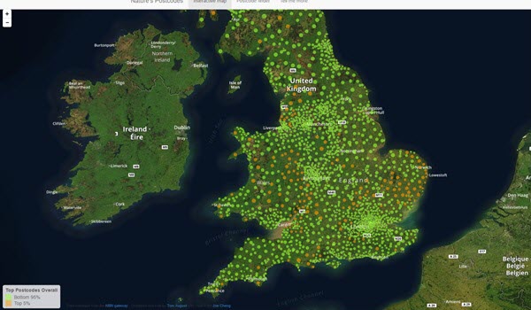
Clicking on any postcode ‘bubble’ reveals the number of records and taxa recorded and the number of recorders and datasets that have contributed to that postcode. Using these statistics each postcode is given an overall score out of 100 for how well recorded it is, with the top 5% appearing as golden bubbles. The best recorded postcodes are typically large rural areas such as Suffolk.
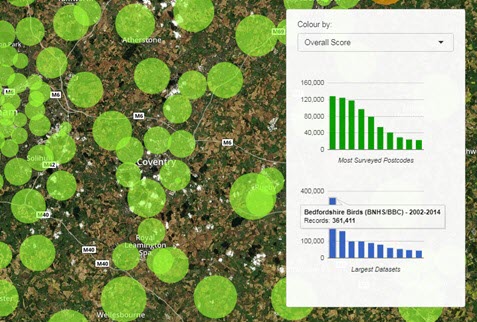
Nature’s postcodes can also be used for identifying the major data contributors in any area. Two graphs show the most surveyed postcodes and which datasets contribute most. These graphs update every time you zoom or pan across the map as they only show data for the area currently displayed.
The website also allows you to browse and search through a table of all the postcodes to quickly find and compare locations and has a page explaining how postcodes are scored and where the data comes from.